6 Tips for Using Your Website Career Page for Recruiting

While the primary job of a website is marketing, a very close second is often recruiting and attracting talent to grow your company’s team.
Many of the principles that we talk about when it comes to generating leads from great-fit business prospects and future customers also apply to the way you can use your website to attract talent. By drawing in the right job candidates, your website career page can be a key part of your overall business success.
Career pages on websites not only allow you to attract good candidates, they also help to screen out those who are not a good fit by providing details about your company. If you’re looking to fill hundreds of roles and aren’t too picky about qualifications—basically hiring “anyone with a pulse”—maybe screening out candidates isn’t a priority. But folks will still be looking at your website for information, and you should be providing it.
You’ll need to do some additional recruiting work to find people too, of course, but chances are, in the process of doing that, you’re going to point them to your website career page for more information. Clear positioning, providing more information than not, and giving people a sense of what it would be like to actually work on your team can go a long way toward attracting the candidates you’re hoping for.
Just as in the sales cycle, prospective candidates want to have their questions answered on your website, not in a job interview. You are essentially selling the role, and you want to create a great user experience for job candidates that makes it easy for them to understand what it would be like to work at your company, while creating the most engaging experience for best-fit candidates.
Make it easy for candidates to find what they’re looking for
Don’t bury your website career page or job listings too deeply in your website; make sure that the page and/or listings are easy to find. Put a tab for “careers” that’s easily visible in either your top or bottom navigation. Use the top navigation if you’re actively hiring or looking for applicants most of the time.

The website career page should be like a homepage for job candidates
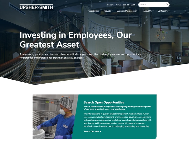
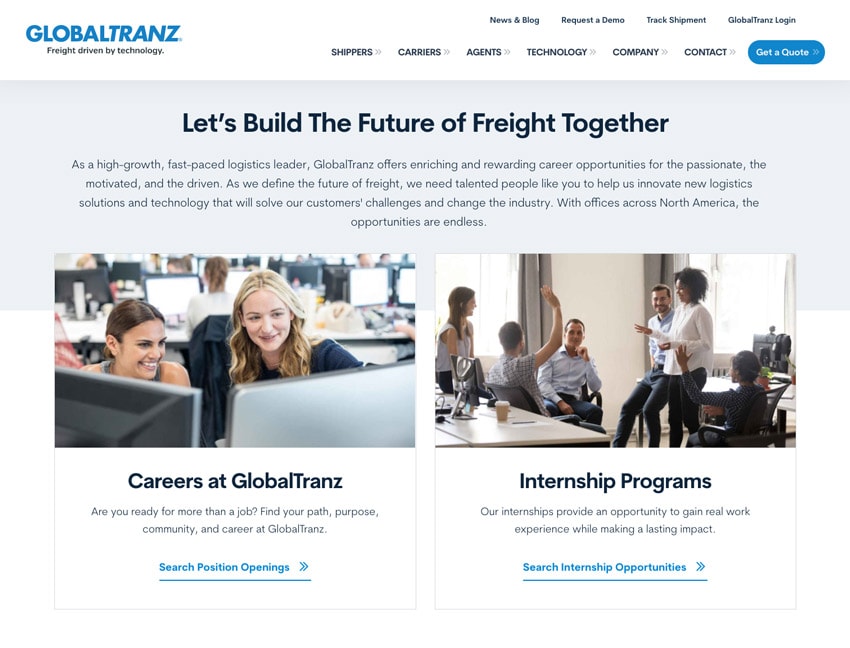
The career page should be like a homepage that gives people a skimmable, scannable overview of what it’s like to work at your company, what specific opportunities are available, core values and mission, and how to apply. Depending on the positions you’re hiring for and your priorities, think about whether you would like your core values, guiding principles, or mission statement to show up first, before the job listings. This strategy puts the listings “below the fold,” which might cause you to lose some people who don’t scroll down the page, but it could also attract those who fit your core values more strongly.

On the other hand, if you’re actively hiring for specific positions, you might want to lead with the actual job listings, after a simple introductory sentence, and follow the listings with values, culture, benefits, etc. At Windmill, it could be argued, our website career page includes so much about our guiding principles and mission that it pushes the job descriptions too far down the page. This is by design, however, as we’re very meticulous about hiring only people who truly live out all of our key characteristics and critical actions. If our end goal is to hire one person, we would rather review 5 resumes from people who are a great match than 100 resumes from people who are all over the board.
Demonstrate who you are
Culture is often misunderstood. Your career page doesn’t have to include pictures of a ping-pong table and charity events (but it’s fine if it does, if that’s who you are). Show your culture, not just in terms of employee outings and fun events, but more importantly your mission and core values (assuming that they’re meaningful and not just something that exists in an HR handbook). Try to convey what it’s like to actually work at your company. What cutting-edge technology will workers get to use, and what will they be learning? What does your company stand for, what will employees feel that they’re a part of, and what purpose will they be contributing to?
This sense of “purpose” doesn’t have to be what we think of as typical charitable causes. Great employees can also find a sense of purpose and belonging by being part of a team that’s marching together, communicating well, and developing great products that help their customers succeed.

If you have photos of happy employees or can generate them, include them on the page. Don’t just include the company picnic photos for the sake of “culture,” but also show what it’s like to actually be at work at your company. If you have that ping-pong table but it never gets used, does it really belong on your website career page? It might attract people who aren’t a fit for your actual, living, breathing culture.
If you have a lot to talk about on this topic, you might want to create a separate “culture” page to paint a very thorough picture for candidates. Career pages on websites are meant to be action driven, so focus on encouraging the visitor to take the next step by completing an application or scheduling an interview.
Trust factors matter
In terms of the marketing function of a website, showing “trust factors” makes a big difference; these are typically reviews and testimonials. This same principle applies in the career section of your website. Showing testimonials from actual employees about why they like working at your company, and linking to Glassdoor or other places showing authentic employee reviews, can go a long way. Even better, record short video testimonials from workers at your company. Make sure you’re showing diversity in the photos and videos that you post. If you don’t have any reviews yet, fill out your Glassdoor profile and ask all of your employees that feel they can give you a five-star review to go write one — and to give you feedback around what it would take for them to give you five stars in the future.
Don’t skimp on information in the job descriptions
Job descriptions should be summarized on the main page, but each one should link to its own detail page. We recommend thinking about these pages as being much like the product or service pages on your website. People want their questions answered here, and it’s best to include thorough information.
Post detailed job descriptions that describe, in bullet form, the key responsibilities and accountabilities of the role. We’re not HR specialists, and there are plenty of opinions about this, but at Windmill, we veer toward putting everything online, so that the listing is basically the same as what ends up in the offer letter paperwork. We figure that if a prospective employee has to ask what their day-to-day responsibilities or accountabilities would be like, that’s your cue that something is missing from the job description and you should add those answers to it. If you’re worried about scaring them away with a certain duty or responsibility, were they ever going to be your best hire anyway?
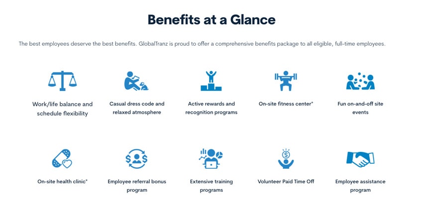
Another area with many opinions is salary and benefits. When possible, show salary ranges and benefits on the listing; it may help attract the right people and remove the noise of sifting through unqualified applicants, saving everyone time. The career page on websites is often where those ideal candidates get their first impression, so be as clear and descriptive as possible to make sure they can see themselves with your company and in the role.

Keep a library of your typical job descriptions on your website. You can either post them only when actively hiring or keep them always available to fill your future applicant pipeline. We like to keep job descriptions of our “active hiring positions” in a “featured” position nearer the top of our website career page, while listing all of our typical positions under a “we’re always looking to meet talented people who fill these roles” heading. If you have a large number of job descriptions—more than 12, say—a filtering and/or sorting mechanism can make this part of your website more user-friendly to career seekers.
The call to action
One of the most critical pieces of any career page is “how to apply.” Make sure that the application process is clearly spelled out and the process is made as un-mysterious as possible. Include a link to an application form on your applicant tracking system or any other external HR tool, or an email address where candidates can send a resume, along with any other required information. Make this prominent at the bottom of your career homepage, all job description/detail pages, and any other page within your career section.
By helping people understand what working at your company is really like, a good career page on your website will screen out potential applicants who aren’t a good fit and attract more candidates who are.


