About SGS
SGS is the world’s leading testing, inspection and certification company, with 98,000 employees and 2,650 offices and laboratories around the world. Among its services in the U.S. are SGS Polymer Solutions Incorporated (PSI), which tests polymers, plastics and other substances; SGS MSi Testing & Engineering, Inc. (MSi), which performs metallurgical-focused testing; and SGS TEC Services (TEC), which performs engineering consulting and construction materials testing.
Situation: Outdated Content and Slow Load Times Meant Testing and Inspection Websites Weren’t Making the Grade
Three U.S. websites for different testing capabilities of SGS were all extremely slow. Sometimes they timed out upon initial loading. In addition, there were issues with less-than-ideal navigation and with outdated content generating SEO value for the wrong topics.
The SGS marketing team in the U.S. knew they needed to solve these critical problems with new, modern websites. They connected with Windmill Strategy through Clutch, an online marketplace that helps businesses find partners in a variety of service categories.
Solution: Reworking Architecture and Information Hierarchy While Using Best Development Practices to Ensure Page Speed
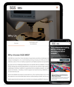
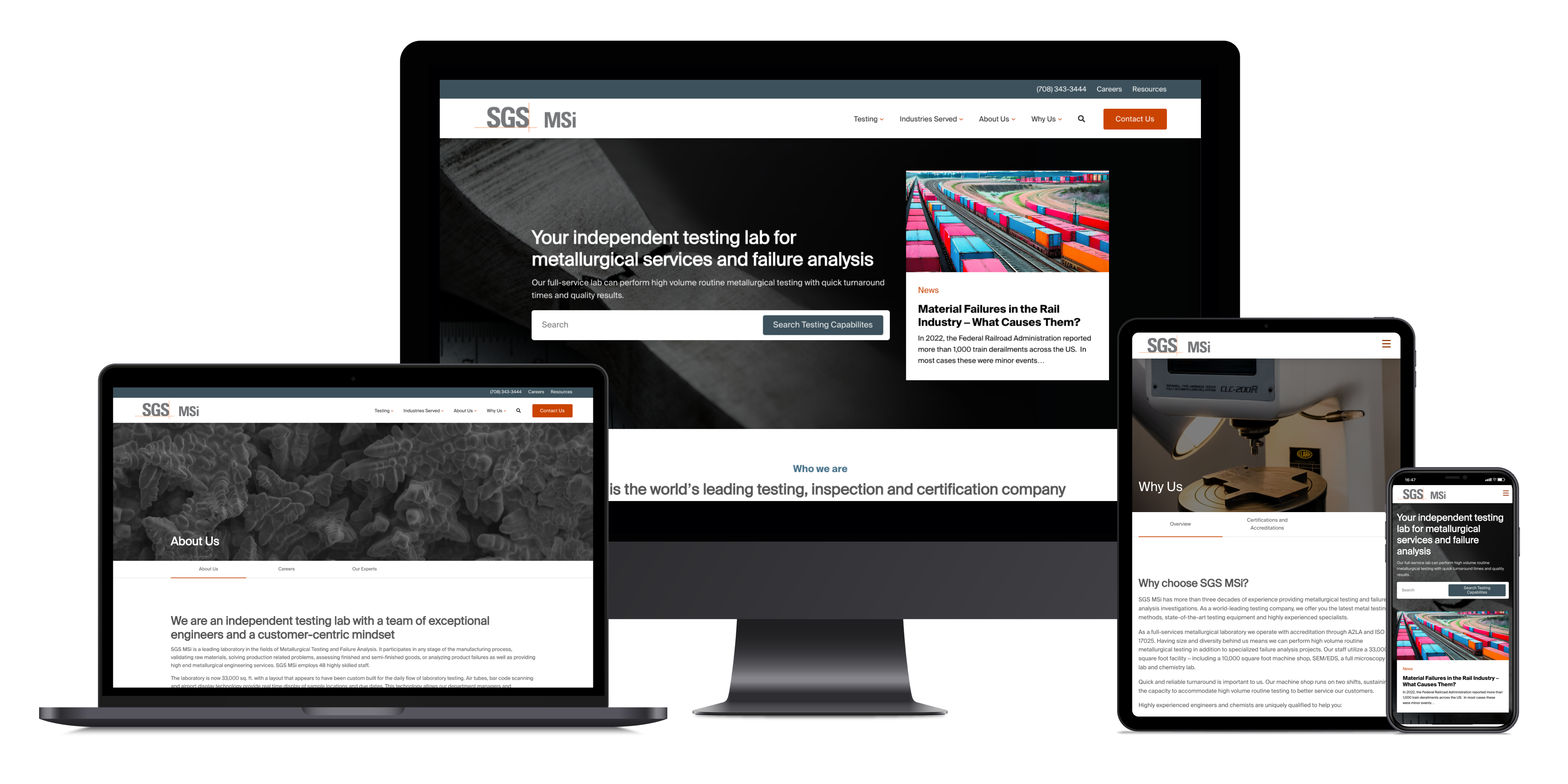
Windmill and SGS developed a plan to begin with one website and build a robust framework that could be duplicated for the other two. They made a strategic choice to begin with the PSI website, the most content-heavy of the three. This framework of UX, design, development and QA could then be duplicated for the MSi and TEC websites. All three would be built in WordPress, optimized for SEO and performance, and designed to be easy to navigate and update.

This presented an interesting and complex mix of duplication and variation. The targeted industries for the three websites vary, as do the calls to action. While the intended audience for each site is often a quality manager, other job titles vary, from chemists for PSI, to supply chain managers for MSi, to DOT managers for TEC. All three new B2B websites also had to be designed to adhere to the global parent company’s brand standards.
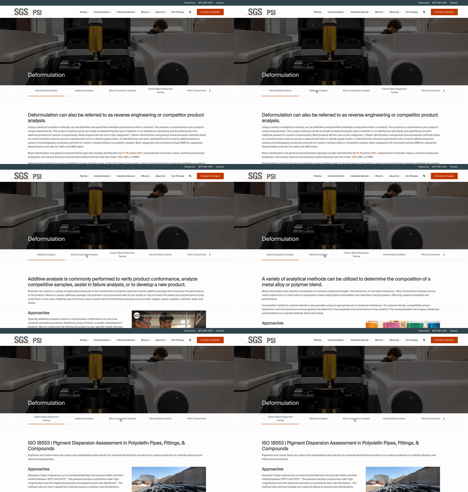
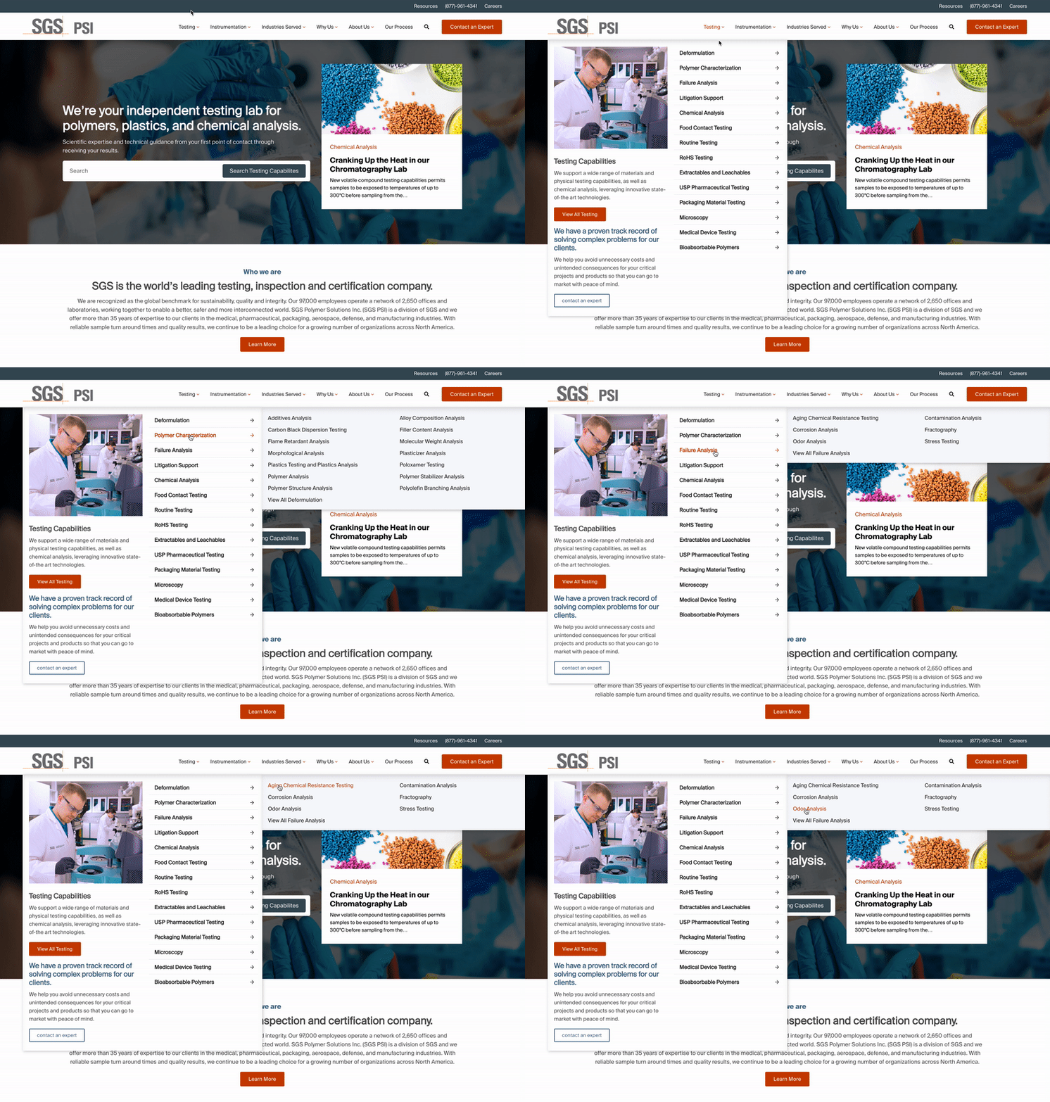
The PSI website is distinct in its extensive content regarding instrumentation for chromatography, spectroscopy, wet chemistry and other capabilities. Its list of specific types of testing capabilities is also much longer than the other two websites. Windmill addressed the complexity of the mega menus by developing a solid UX plan to encompass all the capabilities in a way that would be easily navigable on both desktop and mobile. We also devised unique sub-navigation on the individual testing and instrumentation pages that provides additional guidance to the user.
The client’s involvement was critically important in constructing information hierarchy and taxonomy. We developed a framework with specific parameters to help SGS parse the search categories in ways that were logical for the user without providing an overwhelming number of options. The categories were reorganized and consolidated so that they can be easily scanned via mega menus, archive pages and website search. We tweaked search functionality to be able to serve up more relevant internal site search information and allow the SGS website owners to manipulate search terminologies. Along with updated content, these steps solved the issue of SEO ranking for irrelevant topics.
A focus on development best practices ensured that the new websites would load quickly and create a seamless experience for all users, internal and external. We built all of the websites on WordPress using the core block editor and developed some custom pieces of code to support the massive testing and instrumentation menus. We were able to do some programmatic migration from the old websites to move raw content onto the new platform.


Results: Easy Navigation and Easy Editing with Optimized Performance—Times Three
With websites for SGS PSI, SGS MSi and SGS TEC launching over the course of five months, this complex project spanning a year and a half was completed successfully through great client collaboration and a focus on content strategy. Windmill’s development expertise solved critical speed and performance issues, including eliminating time-outs that discouraged potential customers from viewing the websites at all. The three websites are easy for the client to edit and for users to navigate. With updated, search-optimized content, the websites generate SEO value for relevant and desirable topics. All three are also now truly mobile responsive, and custom design ensures that they adhere to global brand standards while remaining distinct from one another.
Windmill Strategy is a web design company & digital marketing agency helping B2B industrial companies achieve increased visibility, higher quality leads, and greater marketing ROI through smarter web design. Our website design and B2B digital marketing approach goes beyond “more traffic,” seeking out better traffic, by gaining the attention of the specific niche groups of buyers and influencers that represent your best customers. We help our clients communicate and sell their complex products and services to multiple audiences – be it through web design or digital marketing and SEO. Working collaboratively with your in-house marketing and sales team, we design websites that drive leads and sales that result in overall business growth. Schedule a call to learn more.


