About Reelcraft Industries
Known for the quality and longevity of its products, Reelcraft Industries manufactures the widest range of hose, cord, and cable reels. Reels are widely used to help supply air and fluids whenever and wherever they are needed and to improve safety and convenience in industrial and commercial settings by keeping hoses and cables off the floor.
Situation: A Dated Homepage and Tough-To-Edit Database No Longer Met the Client’s Needs
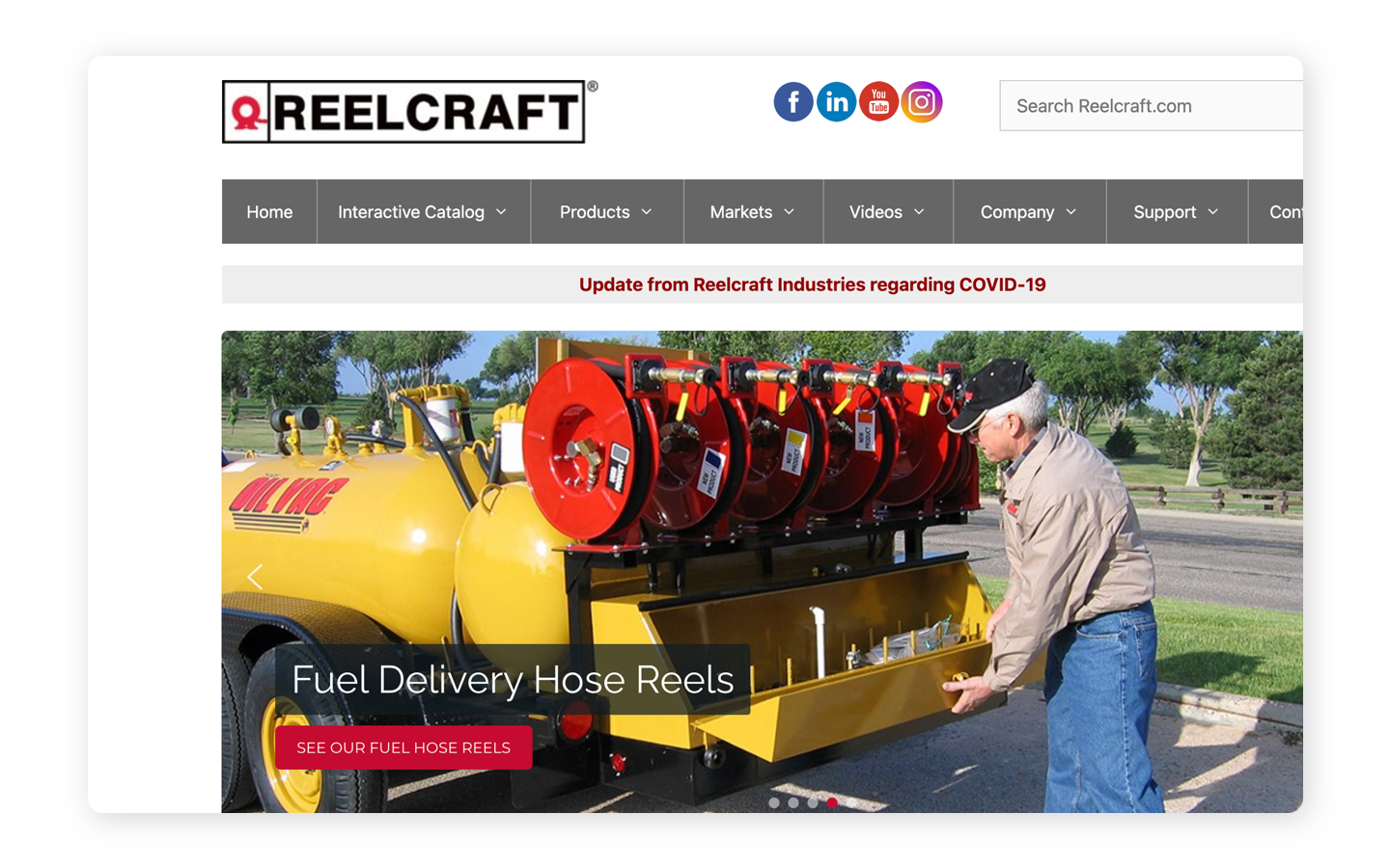
The Reelcraft website did not reflect the latest branding or the company’s leadership in its industry. The homepage, in particular, displayed dated imagery, with confusing navigation that lacked a call to action. Opportunities to optimize SEO and capture leads were being lost.
Reelcraft had recently simplified their offerings by reducing the number of core products. The goal was to make it easier for users to find and select the right product and then customize it. Unfortunately, the process for updating the product database on the website was extremely cumbersome, as was the ability to update the homepage. Certain items had to be updated in the database of the website itself, rather than via the WordPress admin, risking the whole website breaking if something was entered incorrectly.
In addition, the service manuals page required users to navigate a long, confusing list, because there was no way to search for documentation by part number.
Solution: An Agile Approach Combining UX Visual Design with Strategic Backend Improvements
Windmill took an agile approach to the Reelcraft project, beginning with an investigation of the health of the existing site, and a strategy brief that outlined a four-phase plan. Edits were pushed live in stages as the work was completed.
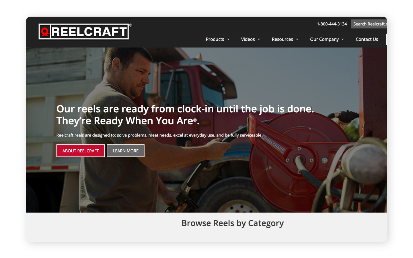
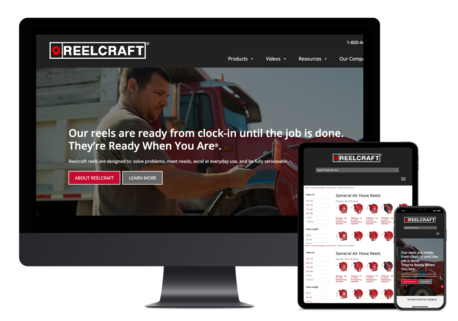
To begin with, we updated the homepage visually so it would better represent Reelcraft’s brand and messaging. This included designing a new navigational structure that is more visually appealing and has a static CTA to capture leads. We cleaned up the main links (adding and removing pages) to focus on the most important areas of the website.
To build out the homepage, we created new styles, blocks, and elements that can be easily added or removed by the Reelcraft team to showcase sales, case studies, or other important information. We also created custom iconography for their product categories, replacing stock cartoon images and drawings that did not reflect the Reelcraft brand.
Before

After

On the homepage and throughout the website, we cleaned up the hierarchy of headings (h1, h2, h3, etc.), which not only improves visual identification of sections for quick browsing but also improves SEO so that Google can easily identify the key information on the page.
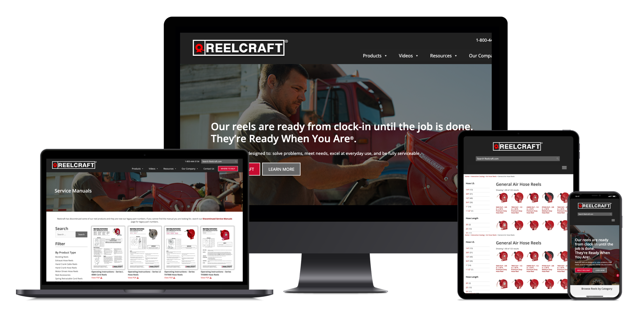
In the product database, subtle changes made big improvements for website users. We utilized commonly recognized UX patterns found on e-commerce websites, such as filtering capabilities for product categories and a “related products & accessories” section. However, the majority of the work was on the backend, creating an easier, less stressful editing experience for the Reelcraft team. Items that once had to be updated within the website database were relocated so that they could be addressed through WordPress admin, eliminating the risk associated with going into the code itself and potentially crashing the whole website.
We also created a better experience for users in the resource archive. Instead of being confronted with one long list of service manuals, tech bulletins, catalogs, and other literature, users can now filter through resources or simply type in their product SKU to retrieve specific resources for their product. The new search functionality is able to search text within PDFs as well as HTML pages.

Results: A B2B Website that Looks Better, Works Better, and Reflects Industry Leadership
The three primary goals of the Reelcraft project were achieved: to redesign the homepage for greater visual appeal and functionality, to improve the product database on the backend, and to create a better experience for users navigating the resource archive. Crucially, the Reelcraft team now has new styles, blocks, and elements to use in building out the homepage, and they can keep the product database current by easily adding or removing products and the key information related to each product, whether text, videos, or PDFs.
With these improvements, which did not require a complete redesign, the Reelcraft website is also optimized to perform better in search results and to capture leads from interested users.
Are you looking for a digital marketing partner that understands the complexities of your industry? Let’s talk today
Windmill Strategy is a web design company & digital marketing agency helping B2B OEM manufacturing companies achieve increased visibility, higher quality leads, and greater marketing ROI through smarter web design. Our website design and B2B digital marketing approach goes beyond “more traffic,” seeking out better traffic, by gaining the attention of the specific niche groups of buyers and influencers that represent your best customers. We help our clients communicate and sell their complex products and services to multiple audiences – be it through web design or digital marketing and SEO. Working collaboratively with your in-house marketing and sales team, we design websites that drive leads and sales that result in overall business growth. Schedule a call to learn more.


